
Sketch.
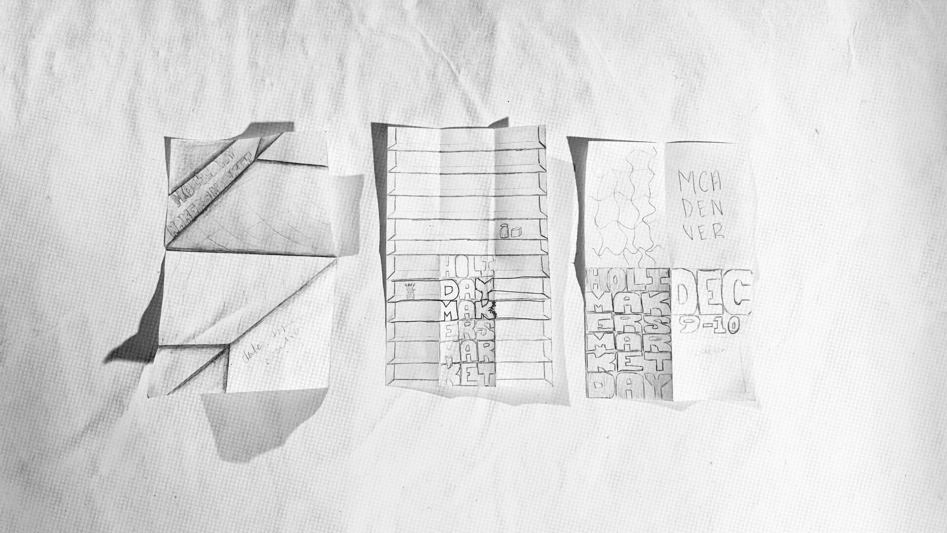
These were my sketches. We decided to implement the concept of shelves in the final poster.
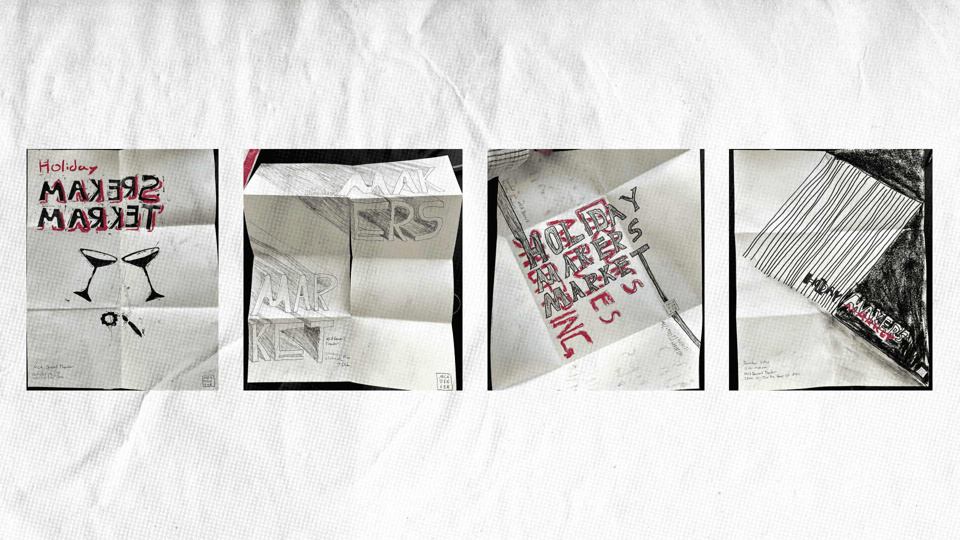
These were Evan’s Sketches. We loved the concept of using stamps in our design.
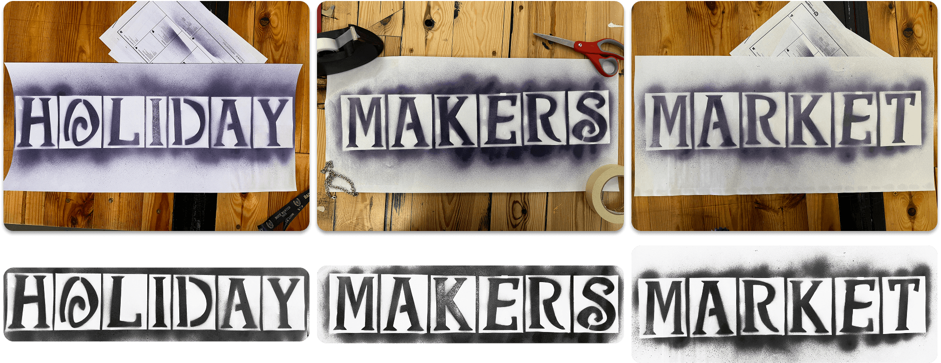
Create.
I created the stamps, merchandise, and spray painted the makers market words, and Evan created the beautiful drawings.
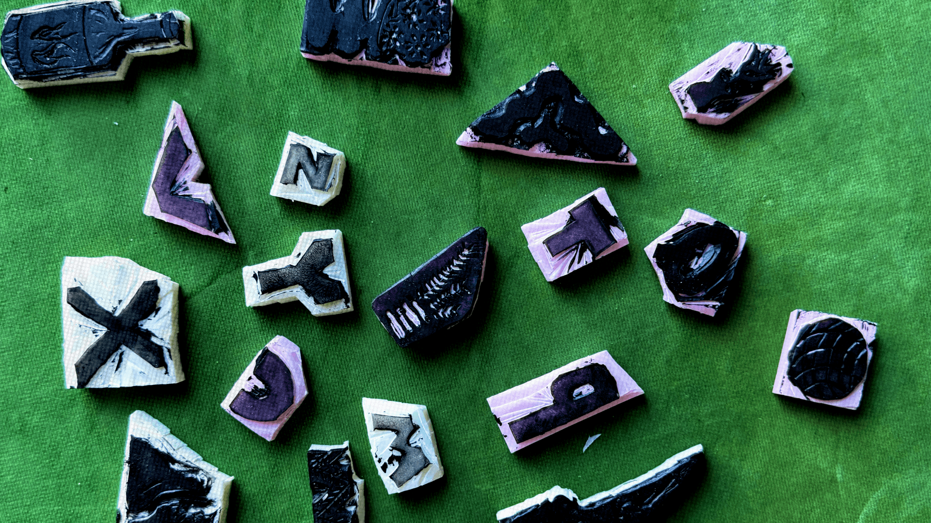
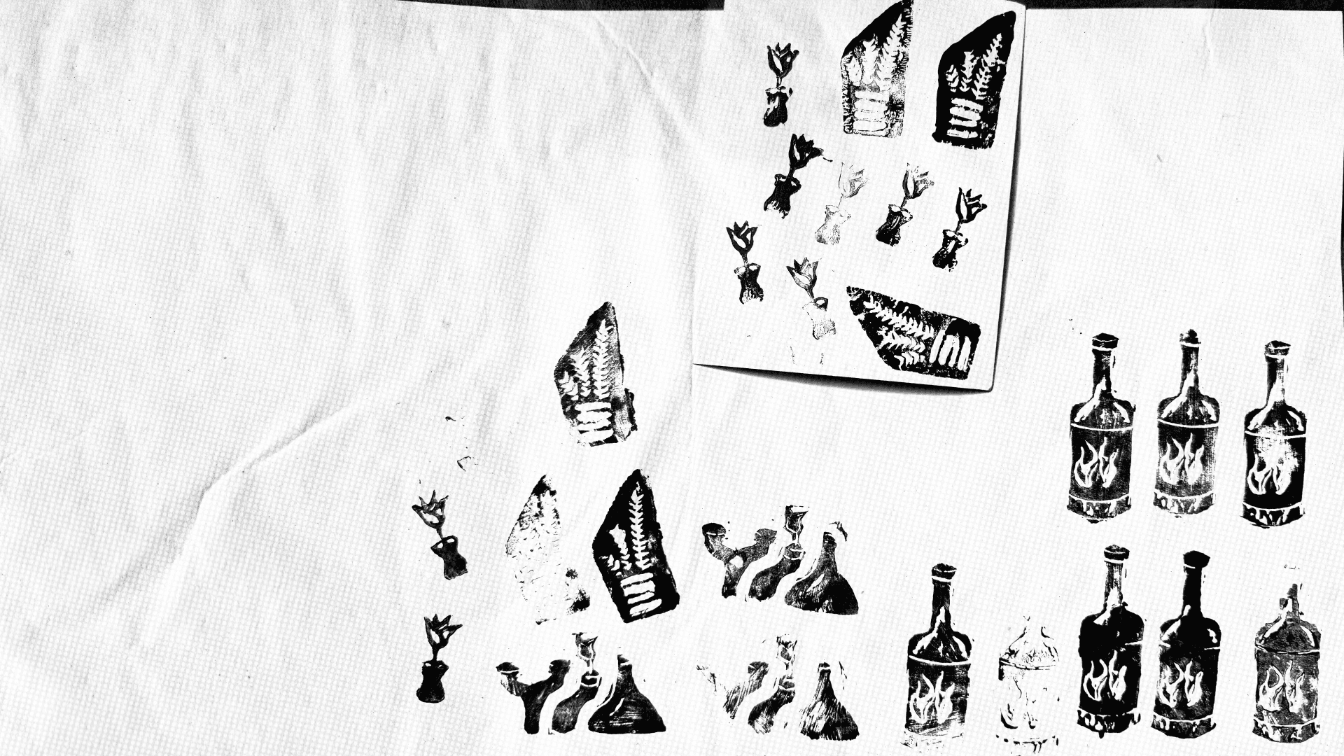
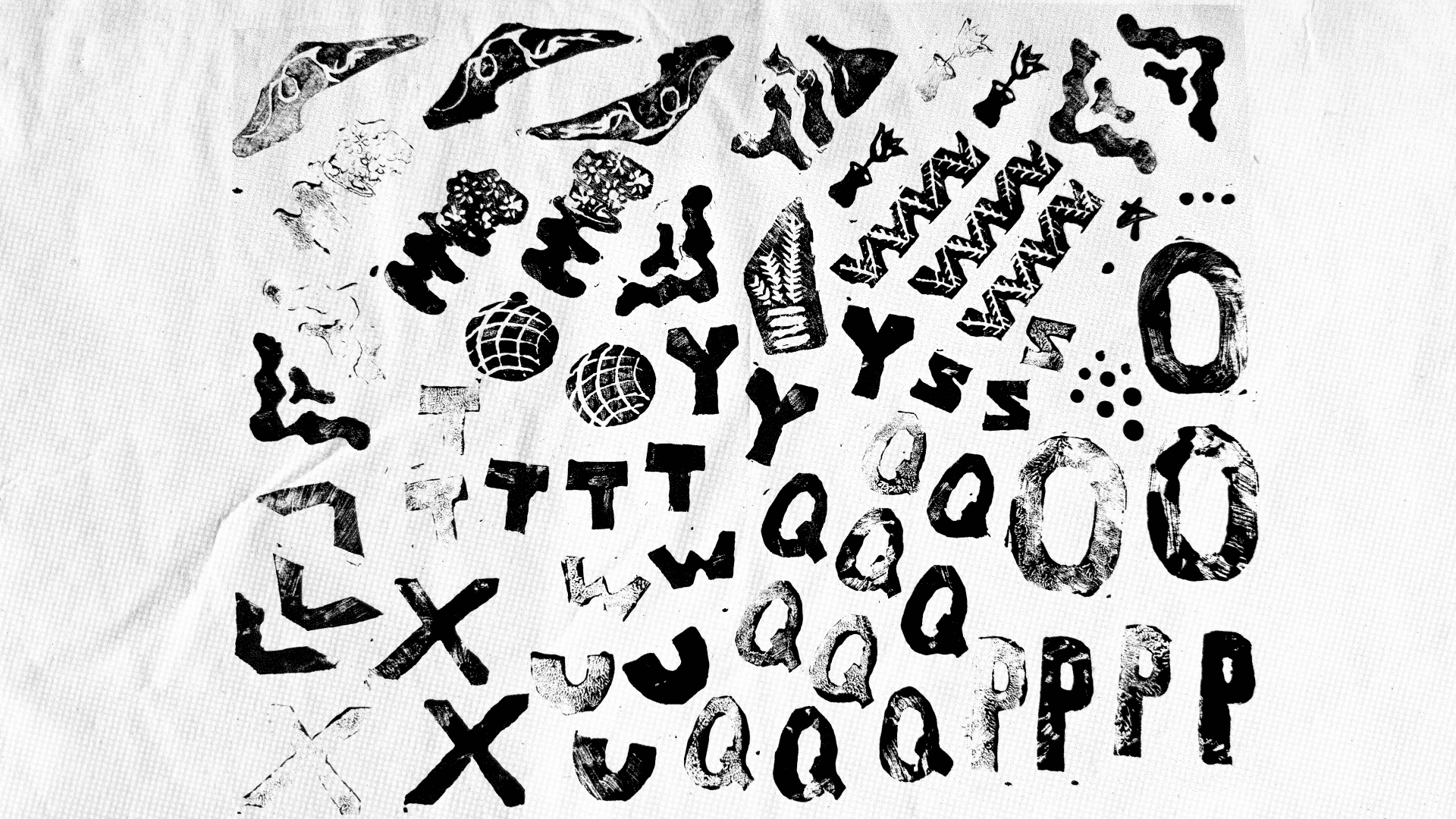
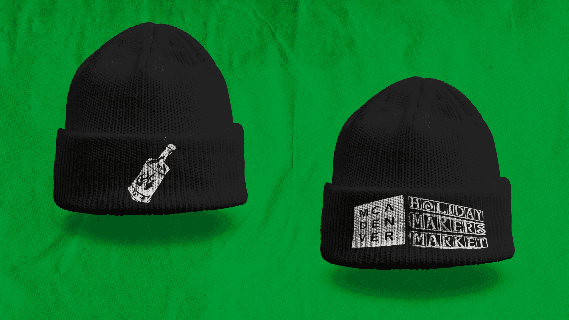
Each of the handmade stamps featured in the poster represents different aspects of the Holiday Makers Market, from the decorative gifts to the flowers. My personal favorite was the hot sauce (the Market has a very long-standing hot sauce vendor who has become quite iconic).
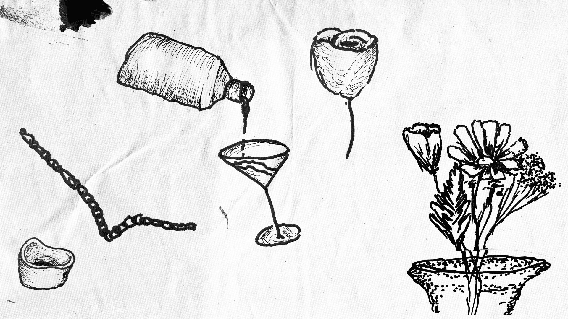
Evan's drawings followed a similar theme, adding to the playful nature of the poster.
Draft.
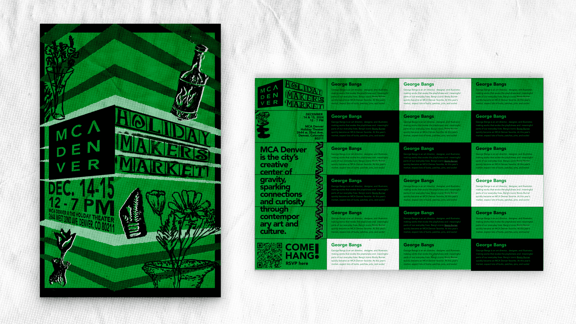
With our first draft of the poster, we decided to create a structure with the information which reflected the MCA Denver building itself, creating shelves around it where we could place our artwork. We wanted it to be very playful, with a hand-made feel. For the back, we planned to place information about each of the vendors who would be present at the market.
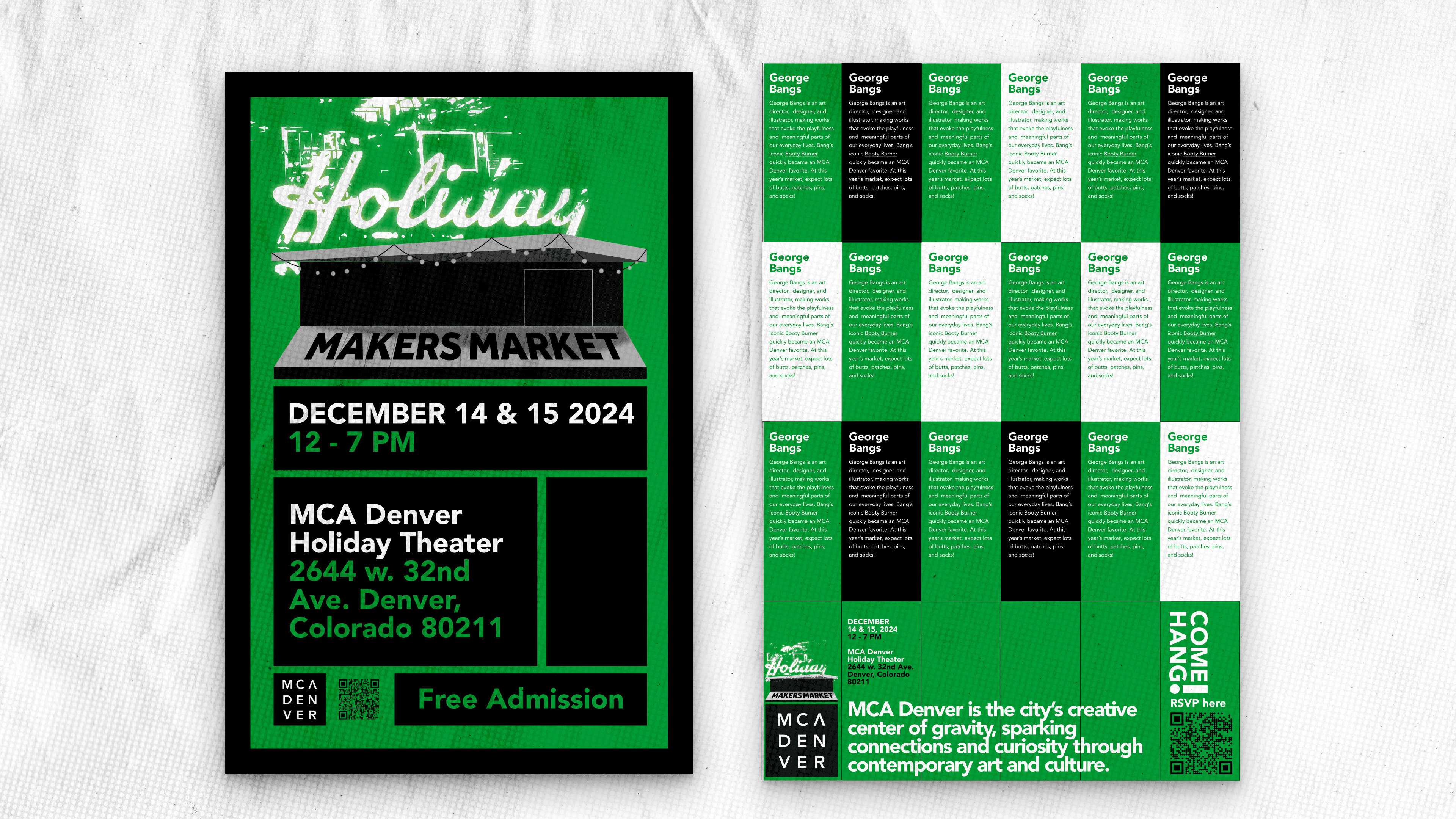
Client feedback from the initial draft led us to a cleaner, more gridded structure for the front of the poster which featured a different building associated with the market and a vertical layout for the back.

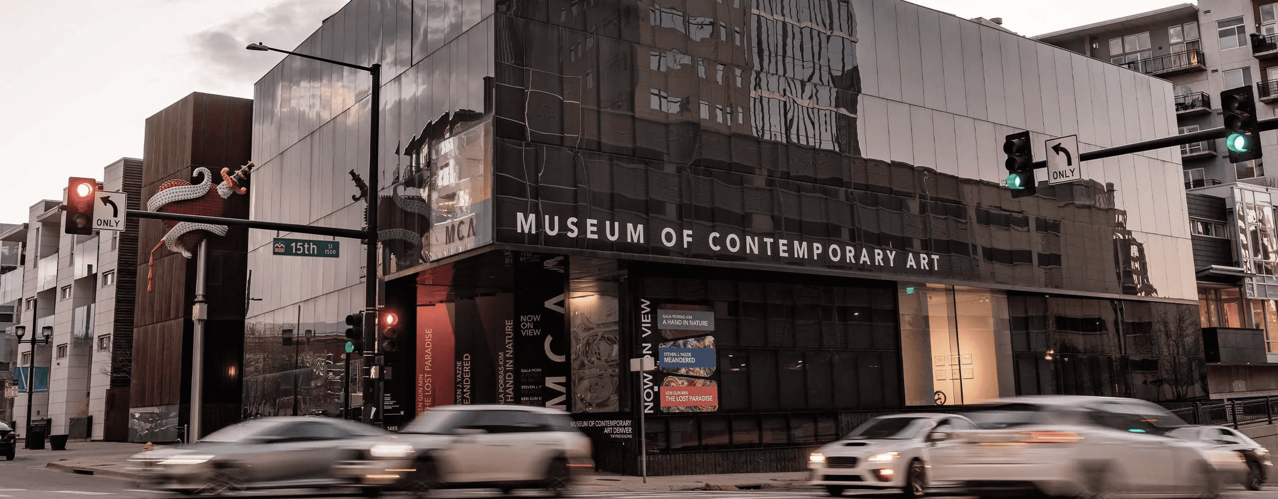
MCA Denver ended up having us go a different direction with this poster, electing for rack cards instead of a final poster. So this is the final version of the poster we made for ourselves, which features a refined version of the original designs and information about us, the creators of the poster, on the back.

Merchandise

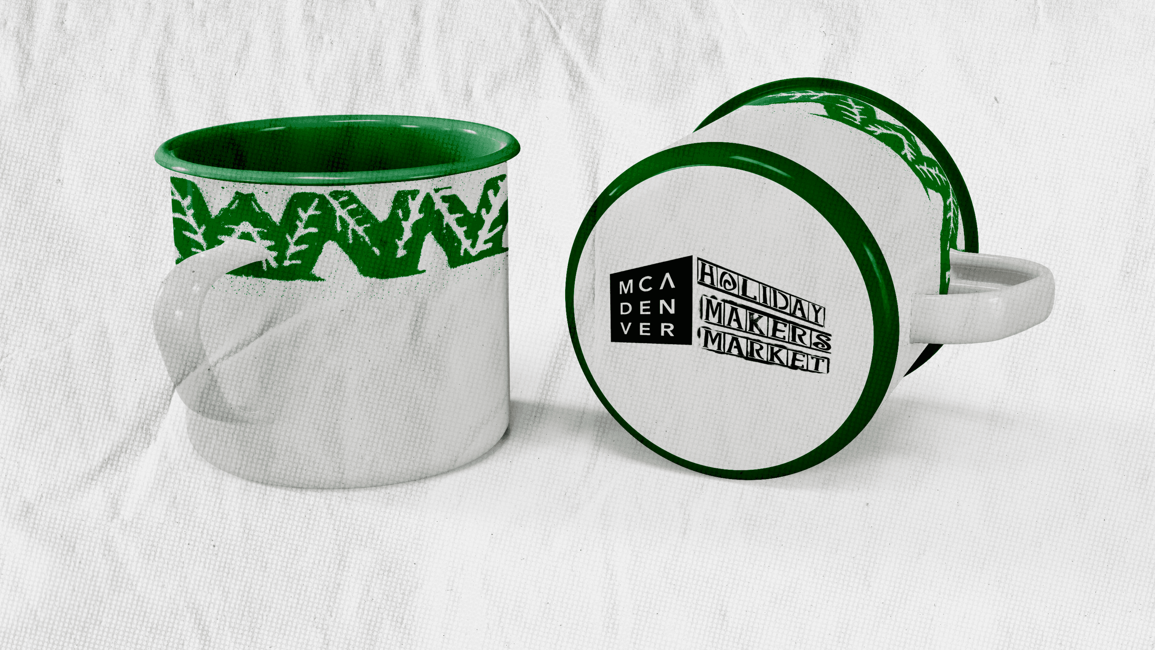
I decided to utilize the stamps and drawings we made to enhance the visual design of the merchandise.
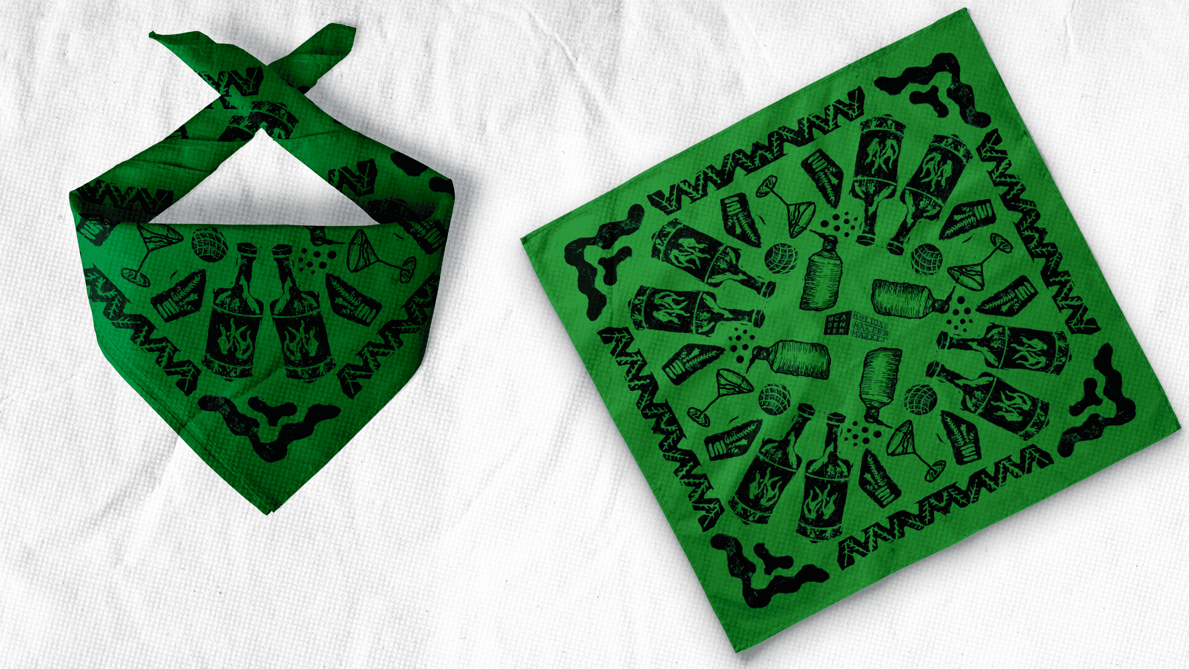
Finals.
I was able to blend my work with Evan's which resulted in something completely unique. I was also able to learn how to screen print in this process, which was awesome.